The Psychology of Color in Beaded Jewelry: How Hue and Contrast Affect Buying Decisions
A woman picks up a strand of lapis-blue beads at a craft market, turns it under the overhead light, and puts it back. She reaches instead for a necklace of warm amber and burnt orange — a piece she had walked past twice without stopping. Asked why, she shrugs and says it "felt right." That moment of intuitive pull is not random. It is the endpoint of a cascade of neurological, cultural and emotional processes that begin in the retina and end in the wallet. Color is the first thing the human eye processes when it encounters an object, arriving before shape, texture or pattern. In beaded jewelry, where the entire surface is color — hundreds of tiny glass, stone or ceramic spheres catching light from every angle — that first impression carries extraordinary weight. Makers who understand why certain hues trigger desire and why some combinations repel can design pieces that connect with buyers on a level the buyers themselves cannot articulate.
How the brain processes color in jewelry
When light enters the eye and strikes the retina, cone cells respond to different wavelengths and transmit signals to the visual cortex. But color perception does not stop there. The brain also engages the limbic system — the emotional center — before the rational, language-driven parts of the cortex come online. This means that by the time a shopper consciously thinks "that necklace is blue," her emotional brain has already formed a feeling about it. Color judgment is faster than thought, and it happens largely below the threshold of awareness.
This neurological shortcut matters enormously in retail jewelry contexts, where decisions are frequently impulsive and emotionally driven. A buyer who pauses at a booth or lingers on an online listing has already been hooked by color before she reads the price or examines the clasp. Research in consumer psychology consistently shows that color accounts for 60% to 90% of a product's first impression, and that people make a subconscious judgment about a product within 90 seconds of initial viewing. For beaded jewelry — a product category with little functional utility and almost entirely aesthetic appeal — that window is the entire sales pitch.
The mechanism is not purely visual, either. The brain cross-references color with memory, creating associations that vary from person to person but cluster around shared cultural and biological patterns. A deep green evokes forests, growth and calm for most viewers, while a saturated red triggers arousal, urgency and warmth. These are not abstract art-theory notions; they are measurable physiological responses, including changes in heart rate, skin conductance and even pupil dilation.
The emotional language of specific hues
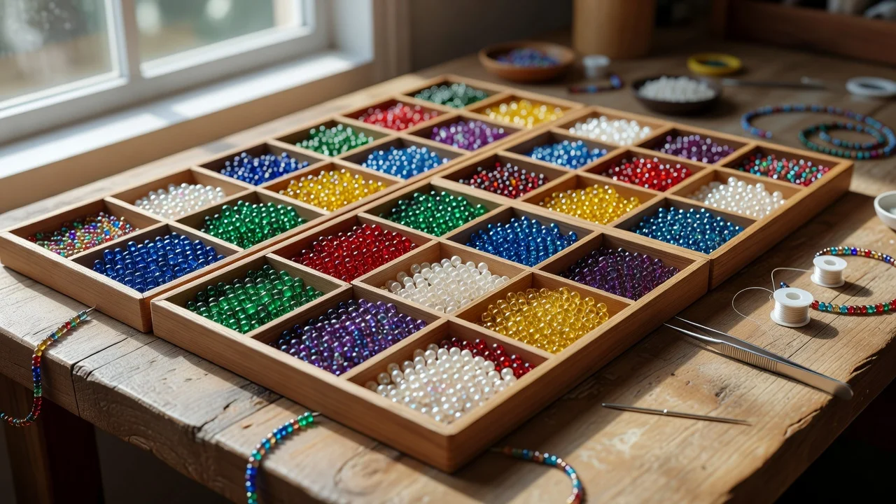
Each color family carries a distinct set of psychological associations that influence how a piece of beaded jewelry is perceived. While individual preferences vary, decades of color psychology research have identified consistent patterns across populations and cultures. Understanding these patterns allows jewelry designers to predict, with reasonable accuracy, how a given palette will make potential buyers feel.
The most commonly used bead colors and their psychological effects are:
- Red and coral — the highest-arousal hues in the spectrum. Red raises heart rate and creates a sense of urgency and passion. In jewelry, it reads as bold, confident and attention-seeking. Small red accents in a predominantly neutral piece draw the eye immediately, while an all-red necklace can feel aggressive or theatrical. Coral softens the effect, adding warmth without the intensity of pure red.
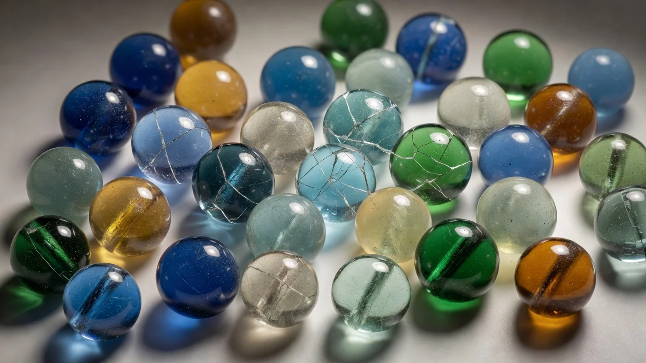
- Blue — universally the most favored color across cultures, associated with calm, trust and serenity. In beaded jewelry, blue ranges from the spiritual depth of lapis and sodalite to the airy lightness of aquamarine glass. Blue pieces feel reliable and timeless, which is why they sell well as gifts. Darker blues carry authority; lighter blues feel youthful and fresh.
- Green — linked to nature, renewal and balance. Green beads — whether aventurine, jade, malachite or dyed glass — evoke organic harmony. Muted greens feel grounding and sophisticated; bright Kelly green can feel energetic but harder to wear. Green pairs well with almost every skin tone, which expands its buyer appeal.
- Yellow and gold — the most visible color in daylight, associated with optimism, energy and warmth. In jewelry, yellow reads as cheerful and approachable. Pale, buttery yellows feel delicate and feminine; saturated gold-yellow feels opulent. Too much yellow without contrast can overwhelm, but as an accent it radiates warmth.
- Purple — historically tied to royalty and luxury because purple dye was rare and expensive. In modern jewelry, purple carries connotations of creativity, spirituality and individuality. Lavender feels soft and romantic; deep amethyst feels rich and mysterious. Purple attracts buyers who want something distinctive without the confrontational energy of red.
- Black and charcoal — the colors of sophistication, authority and mystery. Black beads — onyx, hematite, obsidian, matte glass — create a grounding effect and serve as the most versatile neutral in jewelry design. Black flatters every skin tone and works in every season, making it a reliable seller. Too much black without contrast can feel heavy or funereal, which is why pairing it with a bright accent is a classic strategy.
- White and cream — associated with purity, simplicity and light. White beads — pearl, quartz, moonstone, howlite — feel clean and elegant. Cream and ivory tones add warmth and vintage appeal. White is the most versatile backdrop color, allowing almost any accent hue to pop.
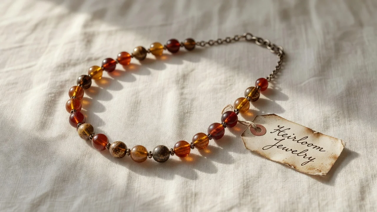
- Brown and earth tones — connected to stability, comfort and authenticity. Wooden beads, tiger eye, agate jasper and ceramic browns appeal to buyers seeking natural, organic aesthetics. Earth-tone palettes feel approachable and unpretentious, making them strong sellers in craft-market settings.
Each of these hue categories does not operate in isolation — its effect is shaped by the colors surrounding it. This is where contrast enters the equation, and where a designer's choices become truly decisive.
The role of contrast in visual appeal
Contrast is the relationship between colors in terms of lightness, saturation and hue position on the color wheel. It is what makes a piece of beaded jewelry feel either dynamic or flat. A necklace made entirely of medium-saturation blue beads in the same value — same lightness, same intensity — will look pleasant but unremarkable. The eye slides across it without finding a focal point. Add a single strand of white pearls or a cluster of amber beads, and suddenly the piece has rhythm, direction and visual interest. The contrast creates tension, and tension creates engagement.
There are several types of contrast that jewelry designers work with, each producing a different emotional effect. Understanding these types helps explain why some pieces command attention from across a room while others, despite using high-quality materials, seem to disappear.
The following contrast types represent the core tools a beaded jewelry designer uses to guide the eye and shape the buyer's emotional response:
- Light-dark contrast — the most fundamental and powerful. Pairing dark and light beads (black and white, navy and cream, charcoal and ivory) creates maximum visual separation. This contrast feels dramatic, structured and confident. It is the easiest to read from a distance, which is why high-contrast pieces tend to catch the eye first in a retail display.
- Complementary contrast — colors opposite each other on the color wheel, such as blue and orange, red and green, or purple and yellow. Complementary pairs create maximum hue tension, producing a vibrating, almost electric effect. In jewelry, complementary contrasts feel bold and playful. They appeal to buyers who want a statement piece, but can feel jarring if the saturation levels are too equal.
- Analogous contrast — colors adjacent on the color wheel, such as blue-green, blue and blue-violet. These palettes feel harmonious, smooth and sophisticated. They lack the punch of complementary contrast but create a sense of flow and unity that many buyers find calming and wearable. Analogous palettes are strong sellers for everyday jewelry.
- Saturation contrast — pairing a vivid, fully saturated color with a muted or grayed version of another color. A bright coral bead next to a soft sage green creates a dynamic that feels modern and artful. Saturation contrast is subtler than hue contrast and appeals to buyers with more refined or adventurous taste.
- Warm-cool contrast — warm hues (reds, oranges, yellows) paired with cool hues (blues, greens, purples). This contrast creates a sense of balance and completeness, because the warm and cool halves of the spectrum represent opposing emotional energies. A necklace that alternates warm amber with cool turquoise taps into this primal temperature association.
The skill of a jewelry designer is not in knowing these categories but in deciding which type of contrast serves the piece's intended emotional message. A bridal necklace calls for light-dark contrast — white pearls against silver or crystal — because it reads as clean and elegant. A festival piece calls for complementary contrast — magenta and lime — because it reads as joyful and daring. The contrast type is the grammar; the color choice is the vocabulary.
Cultural context and buying behavior
Color associations are not universal. While some responses are biological — red raises heart rate across cultures — many are learned through cultural exposure and vary significantly between regions, generations and social groups. A jewelry maker selling at an international craft platform or to a diverse customer base needs to account for these differences, because a color that signals luxury in one market can signal mourning in another.
The most significant cultural variations in jewelry color preferences include:
- Red in East Asian markets — red is the most auspicious color in Chinese, Japanese and Korean cultures, associated with prosperity, celebration and good fortune. Red bead jewelry sells particularly well around Lunar New Year and wedding seasons. A red agate or carnelian necklace marketed to East Asian buyers carries positive cultural resonance that it may not have for Western buyers, who often associate red with aggression or danger.
- White in South and East Asian contexts — while white symbolizes purity and new beginnings in Western cultures (bridal jewelry, pearls, diamonds), it is associated with mourning and funerals in parts of India, China, Japan and Korea. White bead jewelry marketed to these demographics without cultural awareness can unintentionally signal grief rather than elegance.
- Purple and royalty — in European cultures, purple's royal association remains strong and adds perceived value. In some Latin American and African cultures, purple carries religious significance tied to Catholic traditions of Lent and penitence, which can shift its emotional reading toward solemnity rather than luxury.
- Green in the Middle East — green holds sacred significance in Islamic tradition, associated with paradise and the Prophet. Green bead jewelry — especially emerald-toned or malachite pieces — carries spiritual resonance that can make it particularly meaningful to Muslim buyers.
- Black in fashion-forward Western markets — black has been rehabilitated in Western fashion as the color of chic and minimalism. Among younger, style-conscious buyers, black bead jewelry reads as edgy and sophisticated. Among older or more traditional buyers, it can still carry associations with mourning or severity.
These variations mean that a single color palette can produce entirely different buying responses depending on who is looking. A maker who understands her audience's cultural background can tailor her palette to resonate with their specific associations, while a maker who ignores culture risks creating beautiful pieces that feel emotionally wrong to the people she most wants to reach.
Skin tone and the psychology of wearability
A factor that sits at the intersection of color psychology and practical buying behavior is how a bead color interacts with the wearer's skin tone. Buyers do not just respond to a piece as an object — they imagine it on themselves, and that mental simulation heavily influences the purchase decision. If the color flatters their complexion, the emotional response is positive; if it clashes with their undertone, the piece feels "not me," regardless of its craftsmanship.
Color analysis systems divide skin undertones into three categories: warm (yellow or peach-based), cool (pink or blue-based) and neutral (a balance of both). Warm undertones are flattered by earth tones, golds, warm reds, oranges and yellows. Cool undertones are enhanced by blues, purples, cool greens, silver and jewel tones. Neutral undertones can wear both, giving them the widest palette range. The chart below summarizes how bead colors interact with each undertone type and what that means for buying likelihood.
| Bead color family | Warm skin undertone | Cool skin undertone | Neutral skin undertone |
|---|---|---|---|
| Warm reds, coral, orange | Highly flattering — enhances golden warmth | Can clash, may highlight redness | Flattering, adds warmth |
| Cool blues, navy, teal | Can appear stark or drain warmth | Highly flattering — enhances cool luminosity | Flattering, adds coolness |
| Earth browns, amber, tiger eye | Highly flattering — natural harmony | Can appear muddy or dull | Flattering, grounding |
| Purple, amethyst, lavender | Can be hit-or-miss depending on warmth | Highly flattering — complements pink-blue undertones | Flattering across the range |
| Green — olive, moss, jade | Flattering — echoes warmth in skin | Flattering if blue-leaning green | Universally flattering |
| Black and charcoal | Flattering — strong contrast with golden skin | Flattering — sharp contrast with fair skin | Flattering — versatile neutral |
| White and cream | Can wash out if too stark; cream is better | Can emphasize coolness; stark white works | Universally flattering |
| Gold and yellow | Highly flattering — echoes warm undertone | Can clash, may look brassy | Flattering, adds warmth |
What this means for jewelry sellers is that offering a range of undertone-appropriate options broadens the pool of potential buyers. A booth that stocks only warm-toned pieces — amber, carnelian, gold — will naturally appeal to warm-toned customers but may alienate cool-toned shoppers who instinctively feel the colors do not suit them. Conversely, a maker who offers both warm and cool palettes doubles her chances of every visitor finding something that feels personally wearable, and the buying decision — already influenced by emotional color response — gets an additional push from the flattering-skin-tone factor.
Practical applications for jewelry makers and sellers
Translating color psychology into design and marketing decisions does not require a degree in chromatics. It requires attention to a few principles that consistently produce better buyer responses, whether the sales context is a craft fair booth, an online shop or a wholesale catalogue.
The first principle is creating a focal point through contrast. Every piece of beaded jewelry benefits from having a visual anchor — a bead or cluster of beads that the eye lands on first. This is typically achieved by placing a high-contrast element at the center or at a strategic point in the pattern. A necklace of uniform teal beads is pretty; the same necklace with three coral beads at the center becomes a composition. The contrast creates a reason to look, and looking longer is the prerequisite to buying.
The second principle is matching palette to emotional intent. A maker designing a bridal collection should gravitate toward light-dark contrast with white, cream and silver — colors that read as pure, clean and new. A maker designing festival or summer pieces should lean into complementary contrasts — turquoise and coral, magenta and lime — because these combinations feel celebratory and energetic. A maker targeting professional women who want wearable everyday pieces should use analogous palettes — blues and blue-greens, or warm browns and golds — because they feel sophisticated and unobtrusive.
The third principle is curating displays to guide the eye. In a craft booth or online shop, the arrangement of pieces creates its own color composition. Grouping pieces by color family allows buyers to navigate intuitively, while placing a high-contrast piece at the center of a display draws attention from a distance. Many successful jewelry sellers use a "hero piece" strategy — one bold, high-contrast necklace or bracelet placed at eye level — to pull buyers in, surrounded by quieter, analogous-tone pieces that offer wearable alternatives.
The fourth principle is using color in marketing photography to reinforce the jewelry's emotional message. Photographing warm-toned jewelry against a neutral cream or soft brown background enhances its warmth and approachability. Photographing cool-toned jewelry against slate, gray or deep blue backgrounds reinforces its sophistication and calm. The background color in a product photo is not neutral — it actively shapes the viewer's emotional response to the piece, and should be chosen with the same intentionality as the beads themselves.
The buyer's unconscious journey
Every jewelry purchase is a story of color leading emotion, and emotion leading action. The buyer sees a necklace from across a room or on a screen, and the color strikes the retina before she has read a description, checked a price or considered whether it matches anything in her wardrobe. That first neurological response — calm, excitement, curiosity, desire — sets the emotional tone for everything that follows. If the color resonates, she moves closer. If the contrast engages her, she picks it up. If the hue flatters her skin when she holds it against her wrist, the rational mind begins to construct justifications for what the emotional mind has already decided.
The jewelry maker's task is to engineer that sequence — color, contrast, wearability — so that the cascade flows toward yes rather than no. Not through manipulation, but through understanding what the human eye and brain are already looking for. The beads do the talking. The color does the persuading. And the buyer walks away with something that felt right, even if she cannot quite explain why.